If you want your website to be successful, conversion rate optimisation is crucial to success. Just half a percent increase can make a huge difference in the volume of leads your site generates, and more importantly – your ROAS. The effort-reward ratio certainly means you should put aside some time to test. I’ll be referring to multi-variate testing throughout the post. An A/B test if for when 2 pages are very different, rather than small changes on a page.
Identifying areas to test
Start off by splitting a page into sections. Each section usually has a goal such as explaining the product, how a visitor gets the product, what benefits / features a product has.
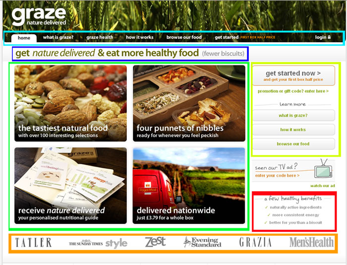
We’ll take the homepage of Graze.com as an example. Take a look at their website, try split it up in your mind and figure out what the aim of each section is.

Fingers crossed you and I have split the homepage into 6 sections. Each are designed specifically to answer a question, or drive the visitor onto the conversion path.
- Cyan – Points to the main areas of the site. Make note of the ‘FIRST BOX HALF PRICE’.
- Blue – What the product does. Eat natural/healthy and have less biscuits.
- Green – Selling points of the product. Quality, quantity, information and delivery.
- Yellow – Call to actions. Pointing the user to essential information. What and how.
- Red – Direct benefits of having the product.
- Orange – Testimonials from big brands
Creating variations
Graze.com have obviously ran experiments to improve their homepage. I cannot see any sections standing out that are wishy-washy or in need of attention. But by identifying the purpose of each section, it’s easier to figure out what they have tested and what to try to test. Here are a few things you could test.
- Cyan – Different wording like ‘50% off first box’ could be tested.
- Green – A new image about choice in your box. Choose nut-free, favourite foods, etc.
- Yellow – As above, a different offer message could be tested. or change ‘get started now’ to ‘pick your box’
- Red – Rotating different benefits could help.
- Orange – The types of brands in this section could be rotated. For example, if health brands all give testimony, the product may appeal to ‘health buffs’. Or if the themes were big tech companies, it might appeal to ‘tech buffs’.
Don’t test more than your site can handle
We’ve identified the sections of a page, and what we can change. Now we need to decide how much to test at once.
The complexity of your testing will depend on how many visitors your site receives. For low volume sites, it’s best to test less variations, as it will take a while for meaningful data to accumulate. For high volume sites (greater than 1,000 visitors a day), you can happily test many aspects of a page, as within a few days you might find a winning combination.
So, what are you waiting for?
If you have any comments or questions, feel free to use the comment box!